Dialog Control Properties
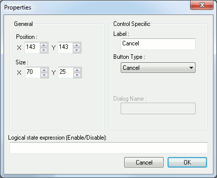
This dialog is used to customize the properties of a dialog item (control) or the dialog itself. Its content can change depending which type of control you are customizing. Only the position and size are commons from all type of controls. The X and Y size fields can be disabled and that means the control which you are customizing cannot have this dimension modified (i.e. Editbox height is fixed).
Here is a list of the options you can encounter on this panel:
X & Y position: Position of the control within the dialog. (All controls)
X & Y size: Size of the control. (All controls)
Dialog Name: Name string used to identify the dialog. To be used with the $FDIALOG function. (Dialog)
Margins: margins to limit the position of controls around the dialog. This is used to facilitate dialog building and therefore is not used at runtime. (Dialog)
Caption: Dialog title. (Dialog).
Variable: Variable name used to access the value from a macro. The variable name have the same limitation as when declared inside a macro. (Editbox, Checkbox, Radio button, Listbox, Combobox)
Logical state expression: Use this text field to specify the logical expression that will be used to enable or disable the control. The control is enabled if the expression evaluate to $TRUE while the control is disabled if $FALSE.
Choice variable: Optional array or sequence variable name to use for filling control choices at runtime. The variable name have the same limitation as when declared inside a macro.(ComboBox, Listbox).
Entries: Multi-line editbox used to fill in control choices. (Combobox, Listbox).
Initial value: Initial text value to appear in control (Editbox) or initial selection of control (Combobox, Listbox).
Label: Static text part of the control. (text, Frame, Radio button, Checkbox)
Initial state: Initial state of checkbox. (Checkbox).
Alternate return value: Alternate value to return instead of using the label. (Radio button).
Initial Selection of groupValue: Check this box to have the current edited control to be the initial selected one of the group. (Radio button).
Button type: Choose the type of the button you want. There is 4 button types: (Button)
“Custom”: A button with customizable label. When the button is clicked, every fields are validate, the corresponding variables are set and the button label string is returned by the $FDIALOG function.
“OK”: Same as a custom one except that the text is set to the language dependent OK string.
“Cancel”: The cancel button have language dependent text and do not set any variables when clicked to exit the dialog. Like the OK and custom buttons, the button label string is also returned by the $FDIALOG function.
“Reset”: The reset button have language dependent text and is used to reset all the controls on the dialog without exiting it.
“Call Dialog”: The call dialog button is used to call another user defined dialog. When choosing the call dialog button type, a new text field is enabled to specify the target dialog name that will be called. The return value of any dialog called using this feature is not used.