The Dialog Editor
The Dialog editor is used to build dialog boxes, which are then used at run-time to query the user for any information that is necessary during simulation. You can create many different dialogs, each with a unique name, which are then activated using the $FDIALOG macro function call.
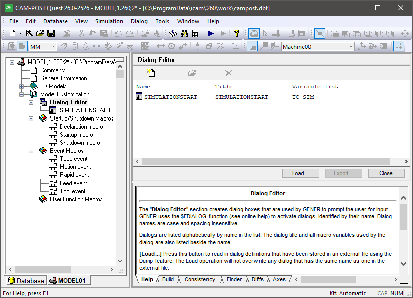
The Dialog Editor Facility
Press the Add button to create a new dialog. You will be prompted for the dialog’s name, which is how the dialog will be identified in the $FDIALOG function call. Spacing and letter-case are not significant in dialog names. Dialogs are listed alphabetically by name. For each dialog, the listing includes its name, the caption title that will appear at the top of the dialog window and a list of all macro variables referenced by the dialog (dialogs operate by getting and setting macro variables). Note that a single dialog containing all user input requirements is generally preferable to the user (if properly constructed) than a series of smaller dialogs.
Select an existing dialog from the list and press the Modify button (or double click on a list entry) to make changes to an existing dialog. Select one or more dialogs and press the Delete button to remove them from the model. This function cannot be undone.
There are also Load and Dump buttons that can be used to read and write dialog definitions from/to external files. Use this feature to copy dialogs from one model to another, or to create “external” dialogs that can be accessed by any model. We recommend that you do not edit dialog definitions by hand.
The Finder utility includes a “Dialogs” option to include dialog definitions when searching through a model for matching text. The Diffs utility also checks for differences in dialogs when comparing models. Dialogs are listed in XML format in the Finder and Diffs windows.
The Dialog Template Editor
When a dialog is first created it consists of a single window frame and two buttons: OK and Cancel. The image below shows an example of the dialog template editor.
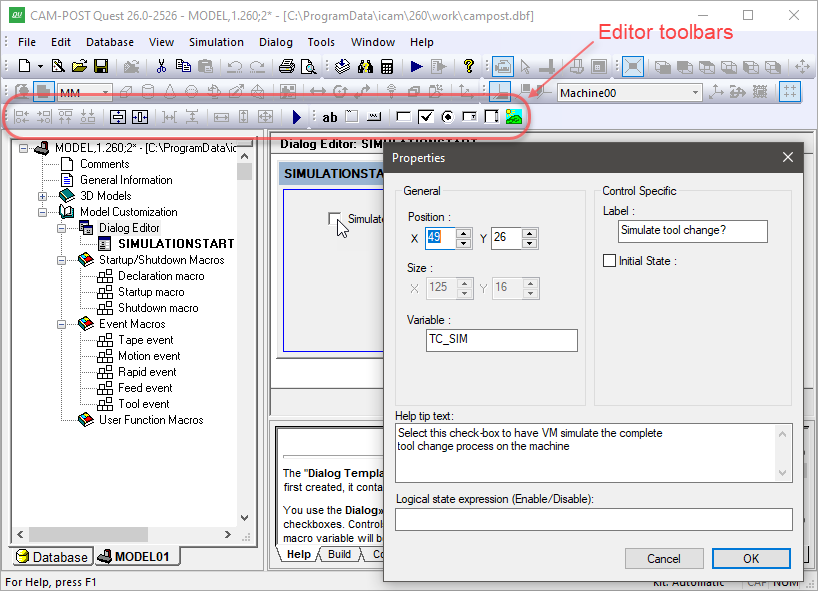
The Dialog Template Editor
The window frame can be resized by selecting it and then dragging (with the left-mouse button held down) one of the three resize points on the exterior of the window. You can also double-click on the window to edit the windows “Properties”, which include: its caption title, name, size in screen pixels and margin (like the margins of a printed page). Similarly, the OK or Cancel button can be selected and resized using the mouse, or double-clicked on to edit its button properties. This behavior is true for all dialog “controls”.
Dialogs can contain a number of different types of window controls,
which can be selected from the Controls toolbar or from the
Dialog»
Text: Use this control to add text to your dialog. Properties include the position and the text itself. You can use line breaks in the text input field to show multi-line text in the dialog. The text control is automatically sized to the required text width and height.
Frame: Use this control to visually group related dialog controls. Properties include the text label that appears at the top-left corner of the frame and the position and size of the frame.
Button: Use this control to create buttons, such as the OK and Cancel buttons. Properties include the text label that appears inside the button, the type of button and the position and size of the button. Buttons with an “OK” type cause the dialog to close when they are pressed, returning the button label text (e.g., “OK”) as the return value to the $FDIALOG function and all dialog macro variables set as shown in the dialog. Buttons with a “Cancel” type cause the dialog to close, returning the button label text (e.g., “Cancel”) and leaving all dialog macro variables unchanged (but initialized if necessary). Buttons with a “Reset” type don’t close the dialog; instead, they reset all controls to their initial state. Buttons with a “Call Dialog” type activate the specified dialog when pressed. A dialog called in this manner must reside in the same model or external file as its caller. You can choose to display (and return) any text you want for a button.
Edit box: Use this control to create a field that will optionally accept user-typed input. Properties include the default value for the field, its associated macro variable, the position and size of the edit box field, an “editable” flag indicating if the field can be changed by the user and a “numeric only” flag with optional minimum/
maximum range limits to force user input to be numeric. When the $FDIALOG function is called, the edit box field will initially be set to the macro variable value. The edit box field will instead initially be set to the default value if the macro variable does not exist, or is $NULL, or is an empty string. The macro variable will be set to the contents of the edit box field when an OK type button is pressed. Check box: Use this control to accept logical True/
False type input from the user. Properties include an optional text label that will appear to the right of the check box, the default set/ clear state for the check box, its associated macro variable and the position of the check box control. When the $FDIALOG function is called, the check box field will initially be set if: the variable is logical and is true; or the variable is numeric and non-zero; or the variable is text and is $TRUE. The check box field will initially be cleared if: the variable is logical and is false; or the variable is numeric and zero; or the variable is text and is $FALSE. The check box field will instead initially be set to the default value if the macro variable does not match any of the preceding, or does not exist, or is $NULL. The macro variable will be set to one of the true/ false conditions, based on the macro variable type, when an OK type button is pressed. Radio button: Use this control to present the user with a series of exclusive choices. Properties include an optional text label that will appear to the right of the radio-button, an optional alternate return value, an initial state setting, its associated macro variable and the position of the radio-button control. When a radio button is selected, the macro variable will be set by default to the label text. You can choose to return something different for the variable by specifying an alternate return value (e.g., a number). You must have two or more radio button controls sharing the same macro variable. You can choose which one is the default state (setting the default state in one control clears this flag in the others). When the $FDIALOG function is called, the radio-button that first matches the current macro variable is the one that will be shown selected. The default radio button will be shown selected if no match was found. When an OK button is pressed, the macro variable will be set to the label text or alternate return value text of the selected radio button.
Combo box: Use this control to present the user with a number of listed choices, available in a drop-down menu. Properties include the list of valid choices and/or a macro variable that will define the acceptable choices, the default value for the combo box, its associated macro variable and the position and size of the combo box field. If you choose to use a variable to define the list of choices, this variable must either be declared as an array or created as a sequence. It must be initialized before calling the $FDIALOG function. The default value will be used if the macro variable does not match any of the choices. The macro variable will be set to the selected choice type when an OK button is pressed.
List box: This control is similar to the combo box control, except that the choices are visible in a scrolling list.
Picture: Use this control to display an image in the dialog. Supported image formats include bmp, gif, jpg and png.
Browse: Use this control to create a text field with browse button that can be set to browse for file or folder. The associated macro variable will hold the selected file or folder absolute path. The control is set to file browse by default. Folder browsing can be selected in the property dialog.
All dialog controls (except for Picture) include a “Logical state expression” property, which can be used to enable or disable the control. The logical state expression can be any valid macro logical expression that evaluates to $TRUE or $FALSE. If an expression is present and it evaluates to false, the control will be disabled (i.e., not available for selection or modification), otherwise the control will be enabled.
All dialog controls accepting input include a “Help tip text” property, which can be used to provide helpful information to the user in the form of a tool-tip that will appear when the mouse pointer hovers over the control.
Controls are initially placed inside the dialog using the mouse. Once
created, they can be repositioned, aligned and sized relative to
other controls using the arrow keys and the functions available from
the Utilities toolbar, or from the Dialog»
The Dialog»